Digital Photography and Imaging | Week 1
Week 1
Lecture
We met Mr Fauzi through Zoom today. Given that it is the first class, he gave us an introduction on what this module will cover and what we will be doing. He showed the timeline, projects as well as past students' works. I did not have any 'formal' art class before, so this was super exciting!
Tutorial
Mr Fauzi showed us a video demo of our first task: to make a physical collage. In the video he found interesting graphics and elements from a magazine and cut it out, later arranging those pieces to make a graphic collage. His words, "messy but neat", struck me, perhaps because it perfectly describes the nature of collages. He then told us to research and prepare materials to make our own collage next week: link here.
Practical
Three tasks were assigned:
- Pick 3 favourite graphic designs from Pinterest and explain why.
- Play the Benzier game at with this link.
- Set up a Pinterest account.
Favourite Design #1

Figure 1: SHUN / NI Poster Design by Lok Ng, Week 1 (23/8/21)
I liked the limited colour here: black, white and red. It is a combination that never fails to make an impact. I found the designer's original meaning as "There are two sides to everything". My interpretation was that the characters, 'shun' and 'ni' were made to contrast each other. 'Shun' was made to be red and neat, contrasting the black and 'messy' brush strokes of 'ni'; and this contrast represented the duality in everything in our lives. I also asked a friend about the particular meanings of each character; 'shun' translates to things going smoothly and 'ni' is the opposite, further deepening the meaning behind the graphics and matching the contrasting visuals.
Favourite Design #2

Figure 2: Eyewear Frame - Be Different by Tesign Co., Week 1 (23/8/21)
When I first saw this, I was immediately attracted to its concept. This feels very creative; all the elements are hung on strings like puppets, each perfectly placed. The product (spectacles) placement is also nicely placed in the spot of the moon. Not to mention, the vibrant blues and overall composition are very satisfying to look at. I feel like this ethereal and crisp concept emphasizes the spectacles' ability to make everything you see in HD.
Favourite Design #3

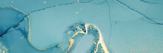
Figure 3: Interstellar Space Matter by Dina Salama, Week 1 (23/8/21)
The fluid graphics here caught my eye - the flow, warping colours and specks all makes it seem like space itself is made into a body of water. The minimalistic fonts and placement of words make it interesting as well. I feel that the spacing kinds of invokes a subtle uneasy feeling, yet, also somewhat of awe. It perfectly depicts how we view the vast interstellar space, full of mysteries and wonders.
Bonus #4 (the design that did not make top 3)

Figure 4: Preserve poster, Week 1 (23/8/21)
This was actually one of the first designs I chose. Similar to the first design, this colour combination caught my eye. I felt that the stark red against the shark and white background could resemble the blood and cruelty faced by these sharks. It is a simple, yet powerful design, but sadly, it lost its initial reign to the designs above.
Benzier Game

Figure 5: Benzier Game, Week 1(23/8/21)
Reflection
I never imagined to have to play a game in the first class. It was an interesting experience to get used to the tools. With all the lines warping and bending according to their own will, I felt frustrated at the harder parts such as the curves or when I ran out of nodes. At first, I wanted to try and accomplish it with as little nodes as possible but I did not know how to do it without compromising the shape. Thus, I decided to use as many nodes as I needed instead, if you can't beat them, make up your own rules right? I ended up with 11 spare nodes from the game. It was fun but it felt like there were never-ending stages to complete.

Comments