Digital Photography and Imaging | Week 5

Week 5
Lecture
Today Mr Fauzi touched on conceptual poster design. The power of posters lies in generating awareness on an issue or conveying a brand message and luring the audience into buying their products or services. To start brainstorming for our poster, we have to ask ourselves the reason behind making this poster. Our theme is Public Service Announcement.
A PSA is a message in the public's interest, targeted towards a social issue. After narrowing down the scope, we can:
- Research about Topic
- Study and gather related information
- Write a summary about the topic
- Highlight key points
- Define title & slogan
- Define details
- Define call for action
- Define Concept
- Create sections for each content
- Sketch the mock-up poster
- Determine if the image can be retrieved from stock or own photography
- Fill in with details
- Start to Develop Design
- Draft digital poster based on your sketch
- Develop composition using Digital Photography and Graphic Design
- Apply colour, typography, textures and effects
- Finalize design with colour correction
A creative poster is made of four key features: Title, Graphic, Text and White Space. Layout, flow and colour affect the order and style of the key features.
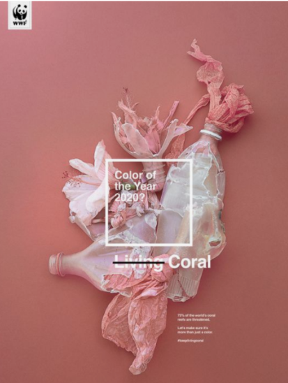
Figure 1: Sample poster 1, Week 5 (20/9/21)

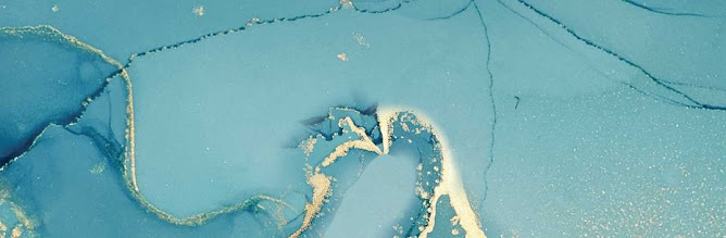
Figure 2: Sample poster 2, Week 5 (20/9/21)
Questions to ask when creating the poster:
- What is the purpose of my poster?
- Am I depicting a clear idea of my poster?
- Does the poster convey its message meaningfully and beautifully?
Tutorial
Mr Fauzi briefed us on Project 2B: link here. We have to create a poster with the theme: Mental Health, Staying Positive in the Pandemic.
Practical
We were also given some exercises to familiarize ourselves with other tools in Photoshop. Tutorial videos and images were provided for us to follow step by step.
- Follow the video tutorial on the Hearst Mansion
- Take a picture of ourselves and apply the techniques to superimpose ourselves in the mansion

Figure 3: Exercise progress, Week 5 (20/9/21)
After cropping the Shazam superhero, we needed to resize it to match the perspective of the mansion. Additionally, adjustments such as matching colour and brightness also needed to be done to make it more 'real'. I also added a little distort effect in Shazam's reflection to make it more realistic.

Figure 4: Hearst mansion and Shazam exercise, Week 5 (20/9/21)
After following the Shazam tutorial, it was time to take our own pictures and include ourselves in the image as realistically as possible. I used Shazam's size to scale myself and adjusted the brightness and colour accordingly. Looking back, I feel like I didn't reduce Shazam's contrast and brightness enough, so I reduced it a little more for myself.

Figure 5: Hearst Mansion and Jane, Week 5 (21/9/21)

Comments