Digital Photography and Imaging | Project 2: Re-colouring and Poster Design

Poster 2A: Re-Colouring Exercises
Tasks to do:
The Hearst mansion image was provided, we had to take our own images to crop into the mansion and make it as realistic as possible.

Figure 1.1: Final Hearst Mansion, Week 5 (20/9/21)
Given the black and white image, we were tasked with recolouring it. Mr Fauzi suggested to make it as realistic as possible with the re-colouring. A video tutorial by Mr Martin is also given for us to follow.
Figure 1.3: Final Re-colouring exercise, Week 6 (27/9/21)
Another video tutorial is provided with more advanced re-colouring techniques such as refining layer masks. We were tasked to re-colour two images: one following the video, another one of our own choice.


Figure 1.4: Advanced re-colouring 1 & 2, Week 7 (5/10/21)
Project 2B: Poster Design
In this project, we were instructed to create a poster with the theme: Mental Health, Staying Positive in the Pandemic.
Research
Before starting anything, we have to research and create a mood board of the type of poster we want to create. I browsed Pinterest for a long long while before finalizing on the bottom three. There were so many cool designs but it was either too heavy, funky or just did not suit the mental health theme. In the end, I settled on clean, minimalistic designs where the photography or graphic element plays a big part in the poster. Honestly, I am a little worried because, in the event where I need to take the picture myself, I don't know if my phone, my photography skills or my face can live up to that expectation.
Mood Board

Figure 2.1: Poster mood board, Week 5 (21/9/21)
Findings
Experiencing the fear, worry, and doubt in the pandemic has become the new normal in the pandemic. The anxiety of not knowing whether the virus was contracted and the and uncertainty of the unknown makes this physical virus one that affects our mental health too. The toll of it all weighs heavily on our minds, where there seems to be no end to these trying times.
Our emotional health can have a big impact on how we feel physically. Being more positive may contribute to a longer lifespan. Covid-19 had impacted many families’ mental health, with the worry and stress rate increasing from 56% to 64% of households with front liners (KFF Health Tracking Poll). Moreover, the pandemic has prevented many people from receiving the care and help they need due to lockdown or shortage of professionals who, unfortunately, have lost their jobs due to the pandemic. Additionally, with people losing their jobs and becoming uninsured, the chances of getting proper help diminish as the pandemic wears on.
While we practice many ways to keep ourselves physically safe from the virus, we also need to address the mental aspect of it. Hence, shifting to a more positive mentality can help us push through. There are many ways we can try to help ourselves and the people around us to stay positive. Connection with friends and family is more important now than ever as lockdown continues to prevent loved ones from seeing each other physically. The news can be a daunting thing to watch, with the numbers and deaths increasing with no signs of stopping. Thus, it is sometimes a good thing to limit how much news you consume. Moreover, finding small positives in everyday life may seem insignificant but focusing on the positives can improve your outlook on your situation.
In summary, the pandemic is not just affecting our physical health, but also our mental health. With added worry, anxiety, and uncertainty, the only people we have are our loved ones and those around us. We can do our part to protect ourselves physically and mentally by staying positive and keeping connections with our friends and family. Negativity can spread like wildfire, and it can be doused with limiting the daily consumption of negative news and focusing on the smaller joys in life.
Key Points
- Covid-19 has impacted many families' mental health with the worry and stress rate increasing.
- The pandemic has prevented many people from receiving the help and care they need.
- Many have lost their jobs.
- Shifting to a more positive mentality can help us push through.
- Connection with friends and family is more important now.
- Limit how much news you consume.
- Finding the small positives in everyday life.
Poster Elements
Title: "Light in the Dark"
Slogan: "Find the small joys in life"
Call to Action: "Be the positive mentality you and your loved ones need in these dark times"
Sketches
I have always been fascinated with the ability of plants to grow almost anywhere; its almost inspirational, the resilience of these seemingly delicate beings. Hence, my first initial sketches involved a theme around a pile of rocks and one small plant growing from it, referencing one in front of my house.

Figure 2.2: Smol plant in question, Week 7 (3/10/21)


Figure 2.3: Poster sketches 1 & 2, Week 7 (3/10/21)
In the first poster (left) I tried to make use of a slanting composition - the text 'in the dark' is repeated against the dark background while the main word 'light' stands out. I thought it would be a fun element to make the dot of the 'i' as a light shining onto the plant who is standing tall despite the rocks around it. The poster overall had a dark background, so I tried a second variation involving a brighter background (clouds) and a different type expression of the word 'light'.

Figure 2.4: More poster sketches, Week 7 (3/10/21)
I was thinking of trying a layout with a different subject and I came across an old artwork I did involving a sparrow. I quickly found out that sparrows can resemble positivity; despite its small size, it can do many wonders, being a fitting subject. The background is also pretty dark, but I extended the letters that it looked like streams of light behind the subject.

Figure 2.5: More poster sketches, Week 7 (3/10/21)
Following Mr Fauzi's suggestion of putting a masked girl in the poster, I cropped out that image and altered it a little to make it look like me :D and quickly drew on a mask on it. This has very modern fashion vibes to it, I kinda like it but I'm not confident in me posing for this hahaha.
Digitization
Following Mr Fauzi's feedback, I continued progressing from Fig 2.4. First, I settled the title as it was the simplest thing to do. For "LIGHT", I used Futura Light as the font (and kinda squeezed/distort the 'G' quite obviously, disobeying my Typography lecturer). "IN THE DARK" was in Futura Medium font.
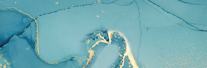
I then moved on to the background, which in the sketch, was a dark, almost flat grey-ish blue colour. I didn't want it to be flat though, so I searched around my room for a texture I can use to take a picture of, and I came across a section of my older painting that could work well as a background :D.


Figure 3.1: Photograph of background texture (left), original painting (right), Week 7 (10/10/21)
I reduced the saturation of the left image to have a pure black and white image and then applied re-colouring techniques to make it dark blue. Provided its the background, there was no masking needed~
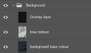
Figure 3.2: Background layers, Week 7 (10/10/21)
I then moved on to crop the sparrow from its original image using the magic wand. The original image was a little too pixelated for my liking, so I took note to convert it to a smart object before resizing it to fit the actual size of the poster. 

Figure 3.3: Cropping sparrow, Week 7 (10/10/21)
I also used re-colouring techniques and the "Matching Colours" tool to adjust the colours of the sparrow to match the original colours of the sketch. To create the warm lighting effect, I used the brush tool to draw the light spots and added different colour overlays over them.


Figure 3.4: Poster progress (left), sparrow layers (right), Week 7 (10/10/21)
I then went and took an image of my hand after jogging (gotta move after sitting at home all day). It felt awkward standing in the middle of a walking path, under the lamp post, with my phone out taking a picture of my hand ._.

Figure 3.5: My ~hand~, Week 8 (16/10/21)
I took over 20 burst photos to get this one.
Then I did a few steps at once: after cropping out the hand I then added overlay layers > applied the "Matching Colours" tool to create colour harmony > scale and fit it accordingly to the sketch > used type-to-path tool to add slogan and call to action along the outline of the hand.

Figure 3.6: Progress without lighting effects, Week 8 (16/10/21)
Happy with the layout and scaling, I added more layers to create the lighting effect (with sparkles).


Figure 3.7: Layers, Week 8 (16/10/21)
I apologize for the lack of layer namings here but I promise I organized it in folders and named those properly. But with that and some minor kerning adjustments, the outcome poster is as such:

Figure 3.8: First draft "Light in the Dark", Week 8 (16/10/21)
Following Mr Fauzi's feedback, I amended the slogan accordingly by experimenting with different text styles (bold, heavy, book..etc) and rendering it to all caps. I also re-did the 'G' and 'H' in the title to fix it and align the crossbars.
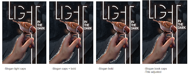
Figure 3.9: Different variations in text, Week 9 (22/10/21)
I found that Futura Book looked best as the slogan line. The final product:

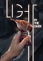
Figure 3.10: Final Poster "Light in the Dark", Week 9 (22/10/21)
Description: A sparrow, though small, is able to do wonders. It symbolizes positivity and being caring and friendly to one another, also meaning community. Hence, the poster incorporated an image of a sparrow on a hand to portray the idea that we can be like the sparrow. Even though we may feel small, we have the ability to spread positivity to the people around us in this difficult time; being the light in the dark. The poster makes use of strong light and dark contrast to emphasize the theme and title "Light in the Dark". Moreover, we can find the small things in life to be happy about when we feel overwhelmed by the weight of everything, thus, such is the call to action.
Feedback
Week 6
Mr Fauzi said I can continue with the type of posters I chose for my moodboard. For the right design, he suggested that I can add a 'futuristic' mask on the person (that could be me). He said that my poster elements were straightforward too.
Week 7
Mr Fauzi liked the ideas of Fig 2.4 and Fig 2.5. He said Fig 2.5 is quite straightforward to do but Fig 2.4 is a little more challenging so I can continue with the sparrow design.
Week 9
He found my sketch illustration impressive (:D yay but not the right module haha) and said I did a good job with the composition and realism. The typography, however, can be improved. The cropping of the G can be lesser / more and the horizontal bar of the 'H' can be made to match the 'G'. The slogan and call for action can have more options as well (eg: caps, bold..etc).
Reflection
Re-colouring
I enjoyed this exercise more than I thought. I found myself really absorbed in making the re-colouring as realistic and aesthetically pleasing as possible, somewhat finding the joy in 'restoring' the original beauty of the photograph's colour. I am more proud of the advanced re-colouring ones :D there's something about those two photographs that makes it very satisfying and pleasing to look at.
Poster Design
This was a very fun experience. I got to improve my Photoshop skills while understanding how to match colours of different elements to make it look coherent. It was also such a happy coincidence that an old artwork managed to be brought to life through this project :D!! While my initial idea for this project was light years away from the final product, I still enjoyed the process of coming up with different ideas and using the creative side of my brain~

Comments